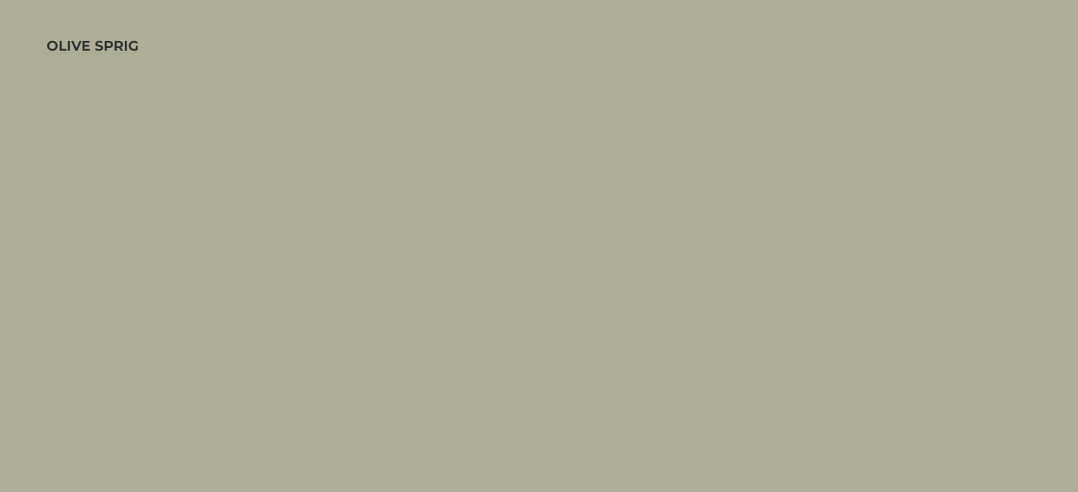
“Olive Sprig is a relaxed, but enticing green that emulates the feeling of soothing aloe vera or a fragrant plant – brightening any space with organic liveliness. A versatile color that lives well inside or outside, Olive Sprig blends in with nearly any environment.”
If that sounds like something you can imagine being part of your life, then PPG’s Color of the Year for 2022 might be exactly what you need. It’s called Olive Sprig and it is a wonderful color to add to any home.
Why Choose Olive Sprig?
The way that PPG’s color is chosen is quite remarkable. It starts with PPG’s Global Color Forecasting Workshop. The annual event brings over 30 PPG global color stylists together to analyze the runway, lifestyles, demographics, geographies, global events, and cross-cultural societal inspirations.
“As many of us know following a year of lockdown, the easiest way to shift your mindset is to change your environment. While we begin to trade sweatpants for strappy shoes, recipes for reservations, and a night in for a night out, our paint color preferences are shifting too, in both residential and commercial spaces,” said Amy Donato, PPG paint senior marketing manager.
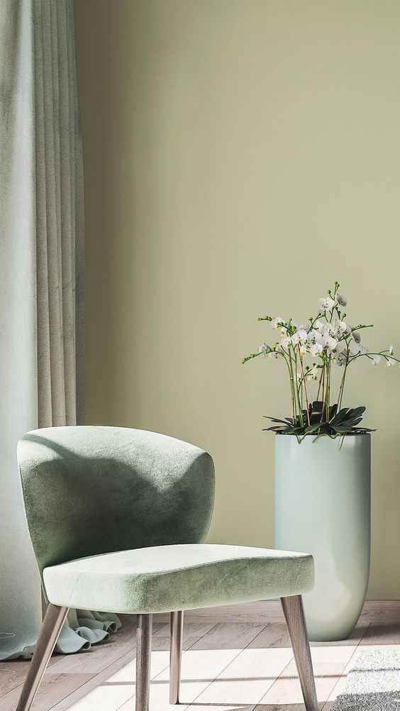
Olive Sprig fits the bill because it is reminiscent of indoor plants and velvet couches, a perfect mix of nature and luxury. It is a perfect balance that we all need. Inborn comfort paired with a little bit of pampering.
Or as the description reads, “This soft gray-green is soothing, like a fragrant plant, reminiscent of the natural world; it brightens any space with an organic liveliness. It is inside or out, the perfect refresh.”
PPG Color Theme: Horizon
The work horizon means something different than it used to. Because after the years we’ve just witnessed, we need to look forward to a brighter dawn. According to PPG, there are three color stories that need to be told.
- Invaluable: The Invaluable palette culminates a rich library of cultural references to imagine its perfect place in today’s world. Drawing Gatsby-esque inspiration from the past to create the go-to glamourous palette of the present, this color story is not afraid to be bold. Grounded with rich hues like PPG’s Gooseberry, Castle Stone and Ancient Copper, the Invaluable palette adds depth and warmth to any space. Pair these colors with rich, dark woods and brass accents to really turn up the drama – especially in the home, restaurants or hotels.
- Introspective: The Introspective color story is for those that prioritize self-care and appreciate life’s simple pleasures. Create a serene and intimate space with colors like PPG’s Tea Time, Peace, Silver Service and Pine Whisper, which complement the soothing comfort of Olive Sprig. These hues are perfect for the private yet soulful consumer looking to create an ethereal bedroom retreat, a thoughtful office space, or add a hint of color to an otherwise neutral-toned kitchen.
- Inspired: Those drawn to the Inspired color palette cannot be pinned down! These mood-boosting shades are sure to turn up the volume in any space and add an optimistic jolt of energy for spaces that need it most – like a statement-making front door, a unique retail environment, or an inspiring child’s playroom. PPG’s Cenote, Aloha and Lettuce Alone offer liveliness and mimic high-tech greens and blues that are sure to turn heads. Warm hues like Paris Pink, Coral Silk and Crushed Pineapple are perfect picks for the confident, social and adventurous painter who wants to spread joy, embrace change and break free from minimalist designs of years past. PPG’s Olive Sprig acts as a muted neutral in this palette to ground the bolder, brighter color counterparts.
Now that we’ve gone over these three themes that work together to create Horizon, let’s go over what each story includes and which colors are labeled under them. Feel free to mix and match or follow along.
The Color Stories
There are three stories, or palettes, that were chosen to represent Olive Sprig. These three stories need to be told and can be told by the colors that are a part of their stories. Take a look at each of them.
Invaluable
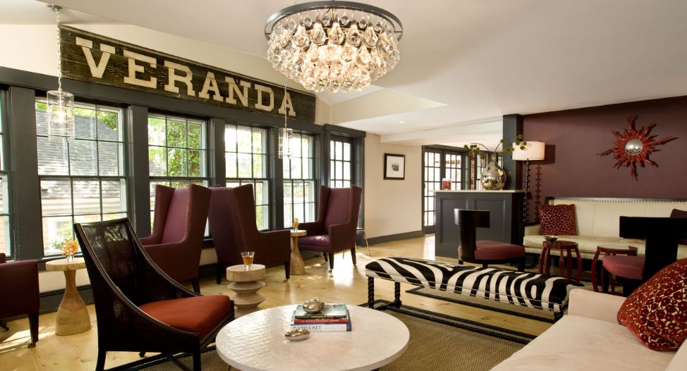
Comfort-nostalgia-reassurance. This is the trinity of the theme Invaluable. Because these three things truly are invaluable to us. They make up what we see as family and everything that family means to us.
Note: descriptions are PPG’s paint color descriptions of the paint color on the PPG website.
- Oyster Shell PPG14-13 – Oyster Shell is a saturated, gray, clay beige with a khaki undertone. It is a perfect paint color for a study. Pair it with wood-toned colors.
- Gooseberry PPG1048-7 – Gooseberry is a dark, shaded, raspberry chocolate purple with a dusty rose undertone. It is a perfect paint color for a sophisticated library or wine cellar. Pair it with lighter neutral sand walls.
- Onyx PPG1011-7 – Onyx is a dark, cool, serious black with a stone undertone. It is a perfect paint color for a main wall or as an accent for your project. Pair it with any color and substrate.
- Ancient Copper PPG1063-7 – Ancient Copper is a dark, muted, apricot orange with a cinnamon undertone. It is a perfect paint color for a kitchen or dining room where warmth and gaiety are required. Pair it with green, yellow or blues
- Vining Ivy PPG1148-6 – Vining Ivy is a deep, shaded, Caribbean aqua with a turquoise undertone. It is a perfect paint color for the exterior. Pair it with deeper toned woods and trim with off-white
- Intrigue PPG1019-7 – Intrigue is a dark, gray, spiced brown with a Sedona red-rock undertone. It is a perfect paint color for an exquisite exterior trim and door, an interior accent wall behind a media center or behind a bookcase for depth and quiet. Pair it with light cream accents.
- Candlelit Beige PPG1207-1 – Candlelit Beige is a pale, bright, sun-soaked white paint color with a dandelion undertone. It is a perfect paint color for any room in your home. Pair it with more brightly colored décor items or other bright paint colors.
- Oceania PPG10-01 – Oceania is a dark, neutral, Caribbean aqua with a turquoise undertone. It is a perfect paint color for an accent wall in a living room. Pair it with off-white trim and touches of gold.
- Winter’s Breath PPG1038-3 – Winter’s Breath is a soft, neutral, arctic blue with a twilight undertone. It is a perfect paint color for a comforting bedroom or on a ceiling. Pair it with soft coral or darker blues.
- Guacamole PPG1121-5 – Guacamole is a saturated, subdued, glass bottle green with a viney undertone. It is a perfect paint color for a bedroom, library or office. Pair it with deep toned wood.
- Castle Stone PPG1128-7 – Castle Stone is a dark, neutral, mature green with a holly undertone. It is a perfect paint color for kitchen cabinets. Pair it with off-white upper trim and gold or brass hardware.
- Ancestral PPG1047-4 – Ancestral is a midtone, neutral, raspberry chocolate purple with a dusty rose undertone. It is a perfect paint color for a meditation space or with grayed or charcoal cabinets in a bathroom. Pair it with white marble and silver accents.
- Antiquity PPG1093-5 – Antiquity is a saturated, subdued, ochre yellow with a mossy undertone. It is a perfect paint color for an open concept room. Pair it with deep toned woods and pewter accents.
Introspective
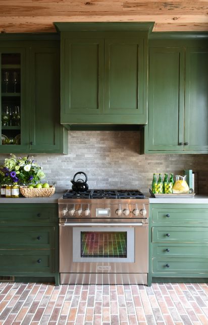
“This quiet and more muted trend includes soft hues with punches of brights. The Introspective palette is welcoming and warm with a casual and mellow tone,” PPG states. It is a calming mix of neutrals and soft warmness.
- Lotus Petal PPG1073-1 – Lotus Petal is a pale, neutral, peachy orange with a brown undertone. It is a perfect paint color for a main wall. Pair it with darker peaches and browns to bring contrast into your space.
- Imagine PPG1094-6 – Imagine is a deep, shaded, baked yellow with a sandy undertone. It is a perfect paint color for an entry or dining room. Pair it with white trim and touches of fine dark woods.
- Carrot Cake PPG1198-5 – Imagine is a deep, shaded, baked yellow with a sandy undertone. It is a perfect paint color for an entry or dining room. Pair it with white trim and touches of fine dark woods.
- Magic Wand PPG1158-2 – Imagine is a deep, shaded, baked yellow with a sandy undertone. It is a perfect paint color for an entry or dining room. Pair it with white trim and touches of fine dark woods.
- Pine Whisper PPG1134-4– Pine Whisper is a midtone, neutral, verdant green with a teal undertone. It is a perfect paint color for a nature inspired home office. Pair it with darker wood accents.
- Burnt Red PPG1188-7 – Burnt Red is a dark, pure, coral red with a raspberry undertone. It is a perfect paint color for any room or front door. Pair it with white trim, gold and emerald.
- Tea Time PPG1054-4 – Tea Time is a midtone, neutral, rusty pink with a chocolate undertone. It is a perfect paint color for a soothing accent or on all the walls and ceiling of a room. Pair it with sage and khaki greens for contrast.
- Silver Service PPG1004-4 – Silver Service is a midtone, warm, monarch gray with an indigo undertone. It is a perfect paint color for bedrooms and dining rooms. Pair it with dark wood with gold accents for a quiet and contemplative space.
- Wistful Walk PPG11-15 – Wistful Walk is a dark, muted, key lime green with a parrot green undertone. It is a perfect paint color for a chic sitting room. Pair it with light wood trim and gold.
- Peace PPG10-28 – Peace is a midtone, gray, orchid blue with a violet undertone. It is a perfect paint color for an any wall or cabinets. Pair it with white trim and light wood accents.
- Edamame PPG1030-4 – Edamame is a midtone, gray, lush green with an organic green undertone. It is a perfect paint color for an exterior or a restful bedroom. Pair it with plum or deep brown.
- Yellow Coneflower PPG1209-5 – Yellow Coneflower is a saturated, bright, sunny citrus yellow with a mustard-yellow undertone. It is a perfect paint color for a foyer, living room or dining room. Pair it with white trim and crown molding for a historic and impressive allure.
Inspired
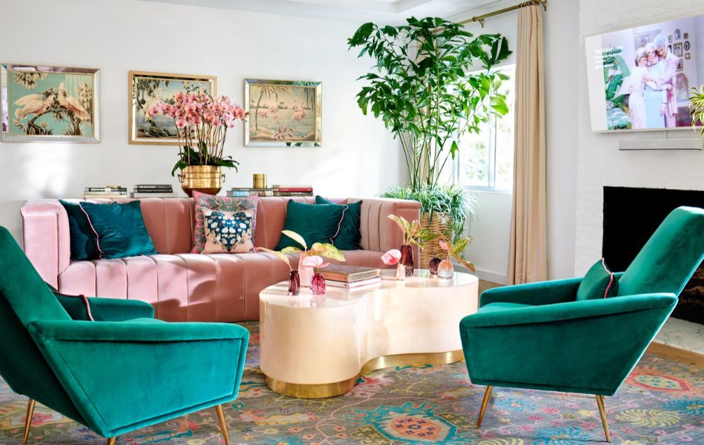
If you get a boost by looking at fun and refreshing colors then try this restart palette that is all about getting inspired. Some people prefer something warm and comfortable, while others like some to reboot them.
- Paris Pink PPG1181-6 – Paris Pink is a deep, pure, fun fuchsia pink with a magenta undertone. It is a perfect paint color for a teenager’s bedroom. Pair it with tints of gray.
- Isle Royale PPG1232-4 – Isle Royale is a midtone, pure, teal aqua-green with a jewel undertone. It is a perfect paint color for a fun playroom. Pair it with gold tones for contrast in accessories or furniture.
- River Rouge PPG1187-4 – River Rouge is a midtone, bright, coral pink with a raspberry undertone. It is a perfect paint color for an accent wall. Pair it with trim in white and lighter woods for contrast
- Atrium White PPG1020-1 – Atrium White is a pale, gray, cosmetic white with a sandy undertone. It is a perfect paint color for interior trim. Pair it with warm shaded walls.
- Coral Silk PPG1195-5 – Coral Silk is a saturated, pure, autumnal orange with a pumpkin spice undertone. It is a perfect paint color for an exercise room or game room. Pair it with chocolate brown accents.
- Cenote PPG17-02 – Cenote is a deep, bright, periwinkle purple with a distant mountain undertone. It is a perfect paint color for an accent wall or foyer. Pair it with light tans.
- Mirabella PPG1176-6 – Mirabella is a deep, muted, pretty peony purple with a grape juice undertone. It is a perfect paint color for a main wall in a bedroom. Pair it with white trim and soft cream furnishings.
- Chilled Mint PPG1224-3 – Chilled Mint is a soft, pure, granny smith green with a grassy undertone. It is a perfect paint color for any space for a soft and uplifting environment. Pair it with white cabinetry and floral print artwork.
- Aloha PPG1229-5 – Aloha is a saturated, pure, peacock green with a seafoam undertone. It is a perfect paint color for a dining room or kitchen. Pair it with corals and yellows.
- Calypso Berry PPG1185-7 – Calypso Berry is a dark, pure, candy apple red with a ruby undertone. It is a perfect paint color for a dining room, in a hallway or front door. Pair it with a varying assortment of green accents.
- Lettuce Alone PPG1222-4 – Lettuce Alone is a midtone, bright, chartreuse green with an electric green undertone. It is a perfect paint color for a bath or powder room, this nature inspired tone brings lots of spring like energy to any space. Pair it with white trim and deep greens.
- Light Sage PPG1124-4 – Light Sage is a midtone, neutral, toad green with an ivy undertone. It is a perfect paint color for a restful bedroom. Pair it with off-white trim and silver accents.
Choosing Olive Sprig
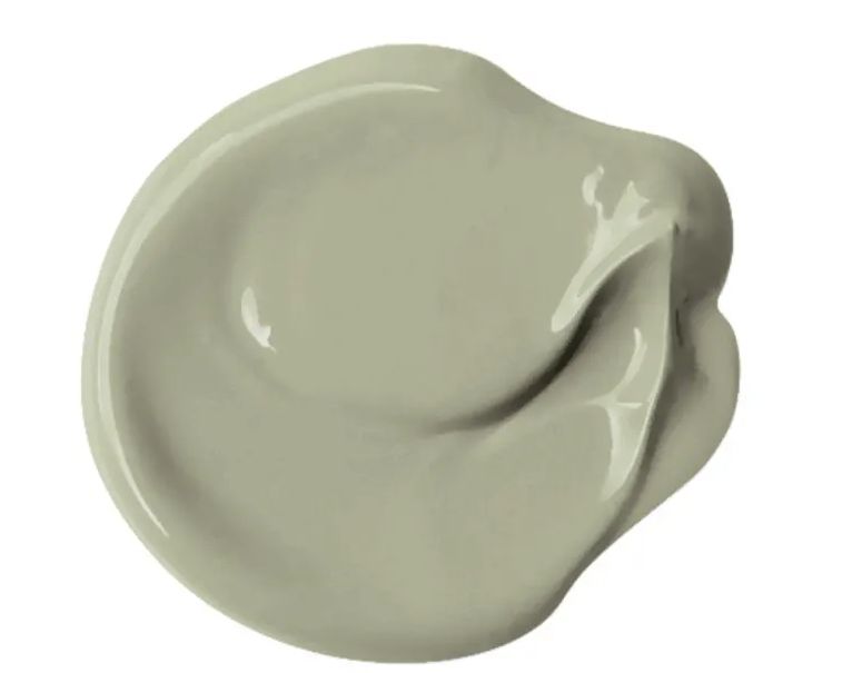
Now that you’ve been introduced to Olive Sprig and all of its companions, you can begin choosing your paint colors for your home. Keep in mind that any one of the colors from the above palettes suit Olive Sprig.
But you can also “branch out” and choose something entirely different than Olive Sprig. But it will always be special if you choose Olive Sprig to remember these years and the “new leaf” that is about to turn over.


Leave a Reply