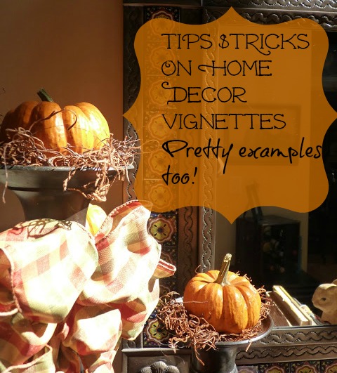
I still crack up over the word home decor vignettes.
I don’t know why, vignettes is just a funny word to me.
Do you know I had no clue what a vignette was until I started blogging?
I had created many, however, I never knew the term.
Sooo…I have been changing up some things in our kitchen, getting ready for the Winter months ahead. Once the leaves all drop in our yard it completely takes on a different look indoors. One I am not too fond of, kind of bare and nakked.
Goodwill silver tray made over to a chalkboard $2.00}
As long as the sun is shining, it’s all good.
I will be doing more cooking indoors as well, soups, stews, sauce, all the comfort foods of Winter.
A little more baking, pumpkin breads, apple crisp, banana breads, and all that good stuff.
Soon this will be all different too.
Christmas decor in the kitchen is coming.
Hopefully, getting inspired with new recipes as well.
There is the roo, for those of you that asked, he went behind the stove.
How easy to top a candle sconce with some moss and a pumpkin for the Fall season.
Here are 8 tips from HGTV.com on creating your own beautiful home decor vignettes.
1. Build your vignette around a light source.
If your arrangement of objects is in a dark corner, it won’t be seen and the effect will be lost. Try building your vignette around a lamp.
If your arrangement of objects is in a dark corner, it won’t be seen and the effect will be lost. Try building your vignette around a lamp.
2. Choose objects to support the style and theme of your room.
If your room is formal, a symmetrical design works best. If the room is casual, asymmetrical groupings are better.
If your room is formal, a symmetrical design works best. If the room is casual, asymmetrical groupings are better.
3. Use color in your vignette to coordinate a room.
Use items in shades that complement the dominant color in a room. Silk flowers or artificial fruit are good ways to introduce color into a grouping of items.
Use items in shades that complement the dominant color in a room. Silk flowers or artificial fruit are good ways to introduce color into a grouping of items.
4. Display objects in odd numbers.
Place several objects of similar shape, size and color together in odd numbers for maximum impact. Groups of three or five work particularly well and are stronger visually than a group of two or four.
Place several objects of similar shape, size and color together in odd numbers for maximum impact. Groups of three or five work particularly well and are stronger visually than a group of two or four.
5. Vary the height of the objects.
Use small pedestals to elevate items. Try stacking books to create a platform for smaller objects.
Use small pedestals to elevate items. Try stacking books to create a platform for smaller objects.
6. Stick to a theme.
Group candles, for example, or family vacation photos. If the vacation photos are from the beach, add a seashell.
Group candles, for example, or family vacation photos. If the vacation photos are from the beach, add a seashell.
7. Create depth.
Place objects from the back of the flat surface to the front instead of in a straight line the length of the surface. Placing objects atop a mirror, or leaning them against a mirror that’s on the wall, is an easy way to create a sense of dimension.
Place objects from the back of the flat surface to the front instead of in a straight line the length of the surface. Placing objects atop a mirror, or leaning them against a mirror that’s on the wall, is an easy way to create a sense of dimension.
8. Vary the textures of objects.
Mix hard and shiny accessories with rough and natural. Use weathered wood or iron architectural elements to introduce an unexpected texture. Photo frames, which come in finishes from shiny enamel to beaded, offer an array of texture options.
If you are not a regular here, I sure would love to see you back again. Stick around and browse a while.


Leave a Reply